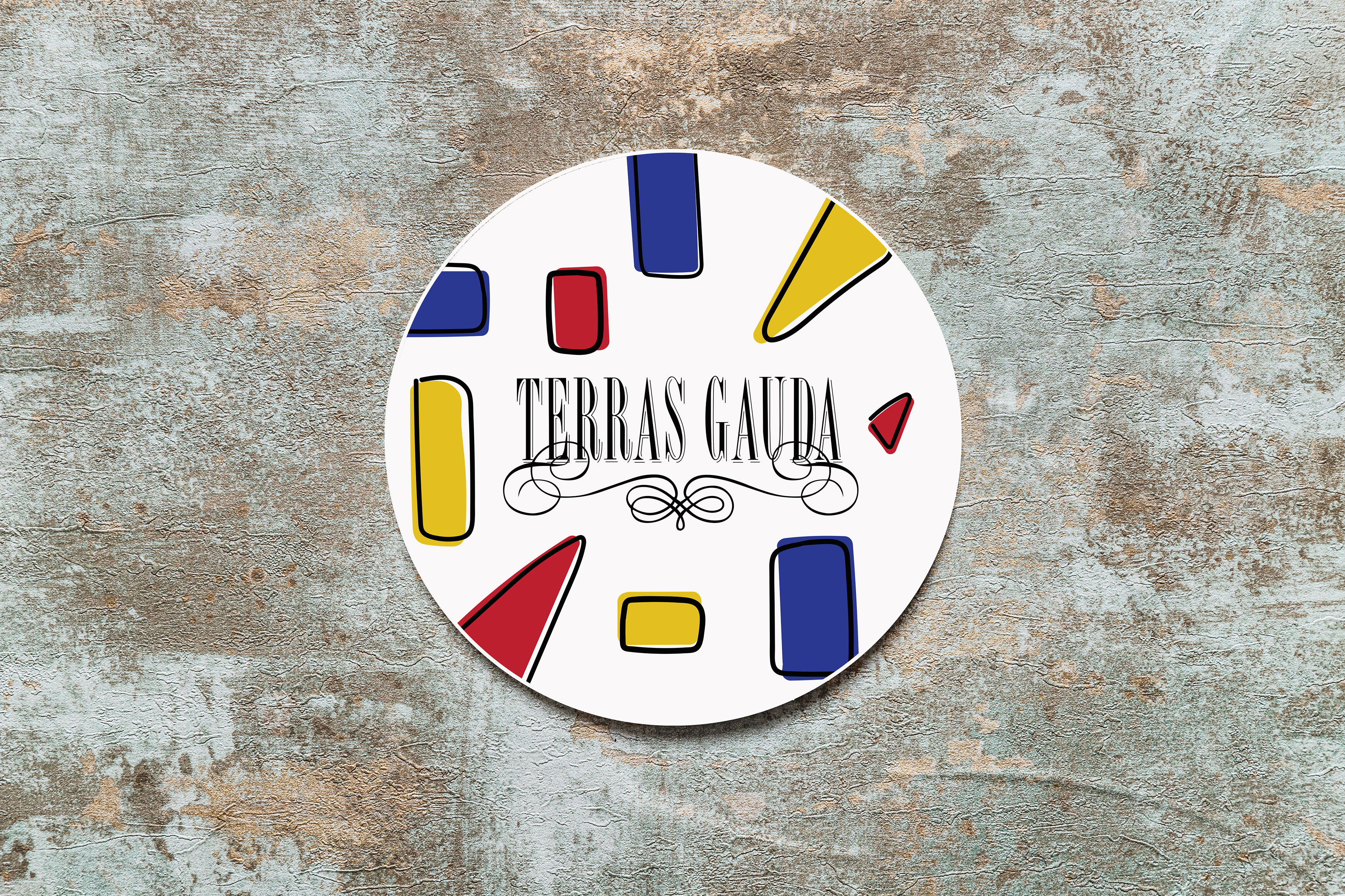
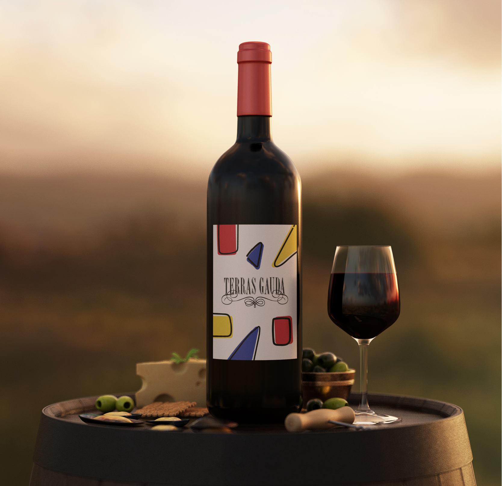
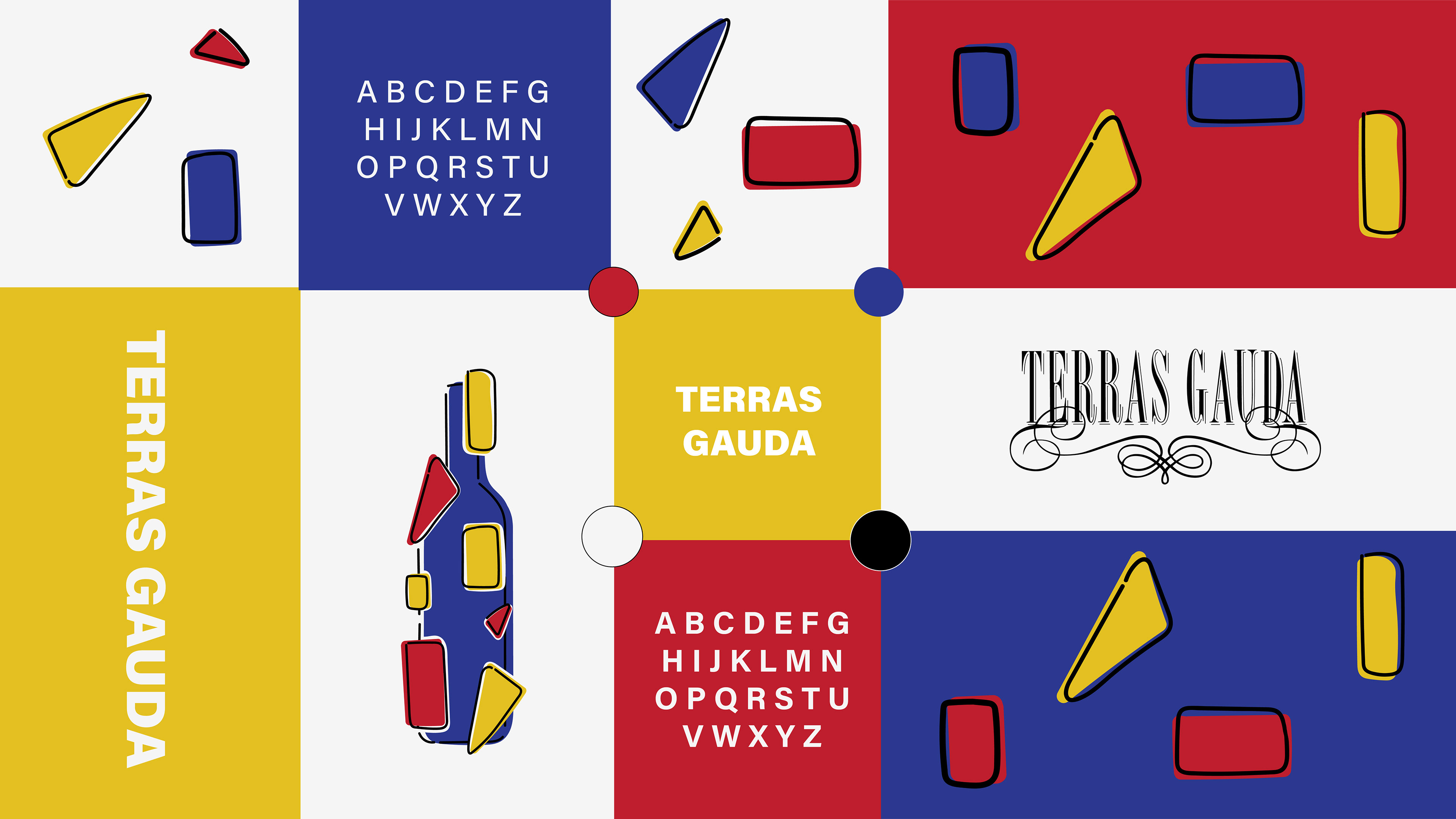
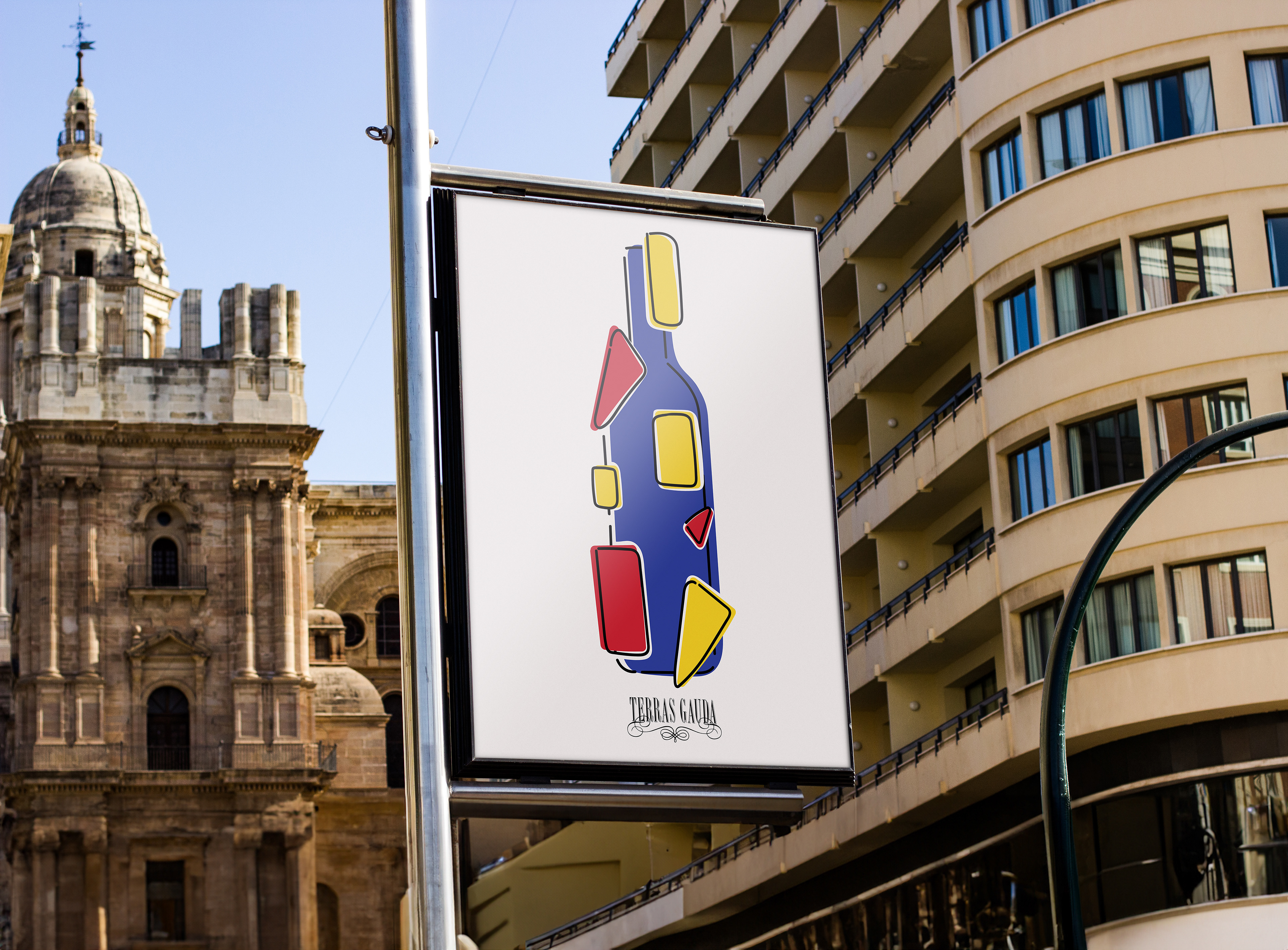
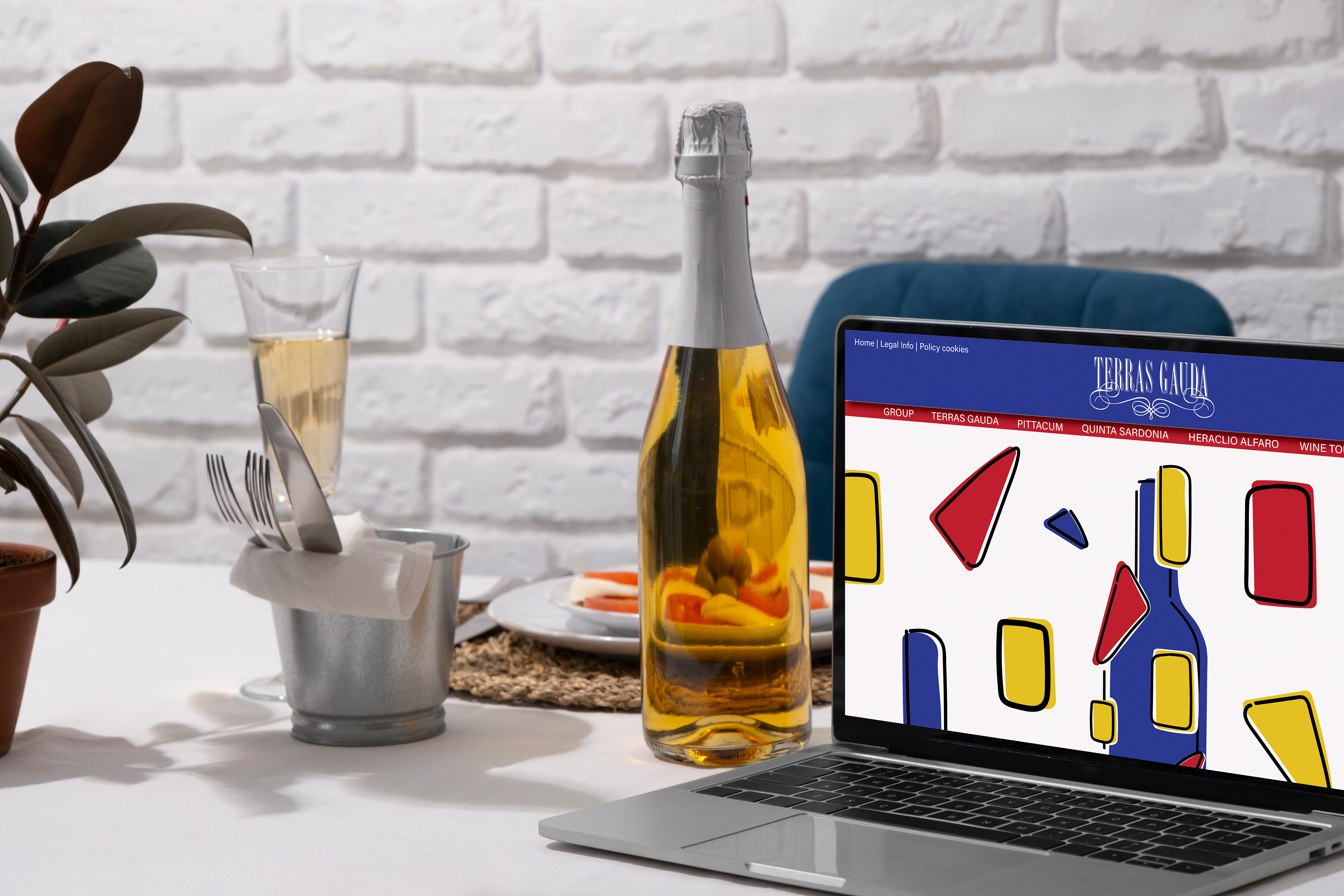
This brand refresh was created for Terras Gauda Winery, with a concept focused on abstractly representing the shape of the wine bottle. I achieved this by incorporating geometric shapes, such as triangles and rectangles, cut out from the bottle and placed both on top, to the side, and along its outer edges. The shapes are deliberately imperfect, reflecting the smooth, organic form of the wine bottle and symbolizing Francisco’s passion for geometric art. Many of his early works prominently featured geometric patterns, shapes, and grids. Additionally, the shapes are intentionally incomplete or unfilled, mirroring the natural imperfections of the grapes and ingredients used in winemaking. The color palette draws from the primary colors—red, blue, and yellow—which were often present in Francisco’s artwork. Blue is the dominant color, chosen to represent Vigo, Spain, the town where the winery is located, and its connection to the surrounding waters. The light beige background nods to the light-colored stucco homes of Vigo, adding a sense of place and cultural reference. This design is targeted toward travelers and wine enthusiasts, aiming to capture their attention and connect them to both the art and the origins of the wine. The poster was featured at the Francisco Mantecón Competition in Vigo, Spain, further showcasing its connection to the local culture.
Client: Terras Gauda
Focus: Brand Refresh
Media: Adobe Illustrator, Adobe Photoshop, Adobe InDesign
Style Tile
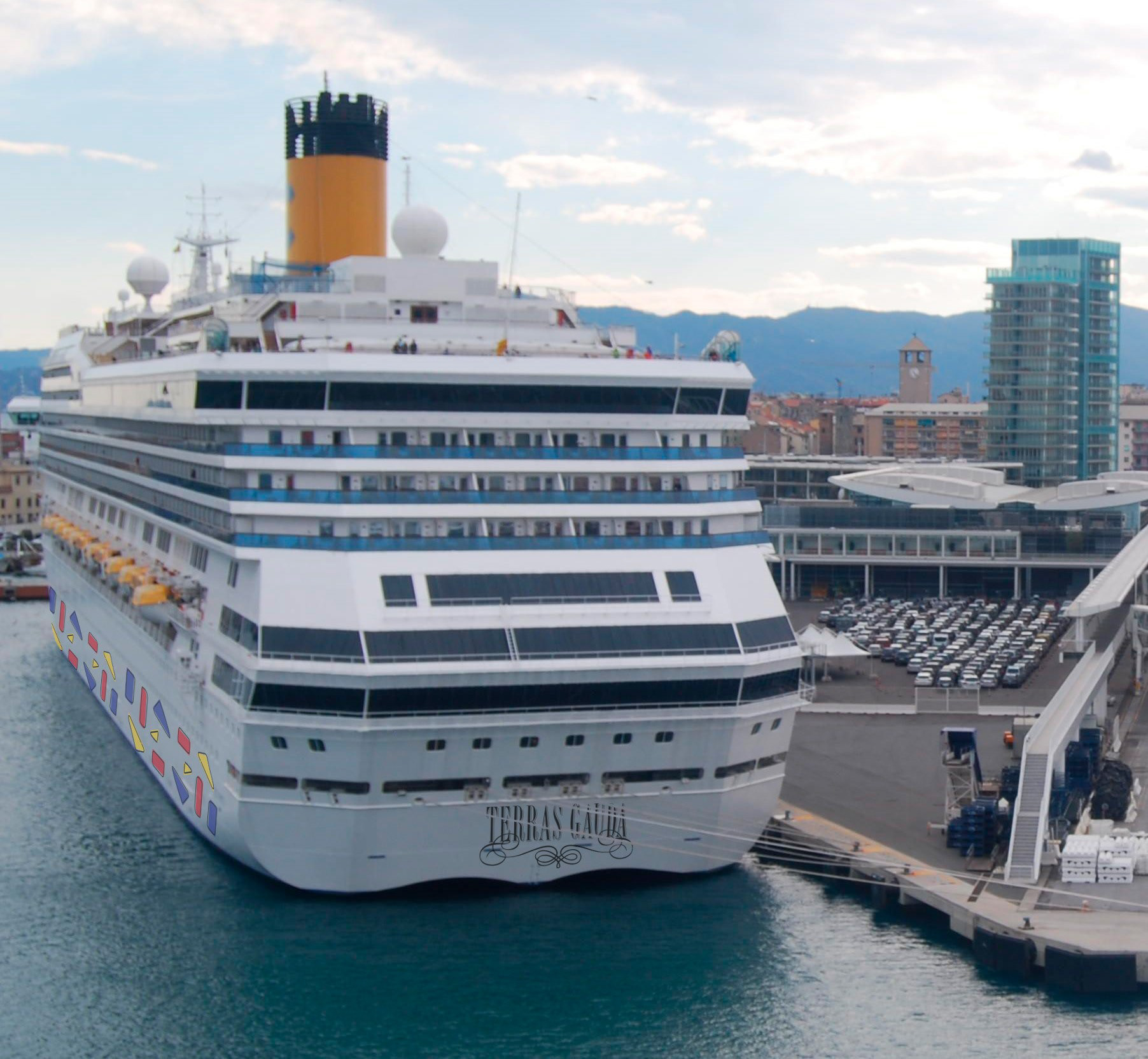
Port in Vigo, Spain
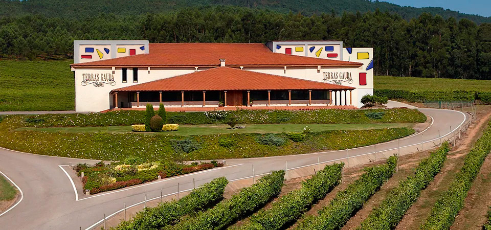
Terra Gauda Winery
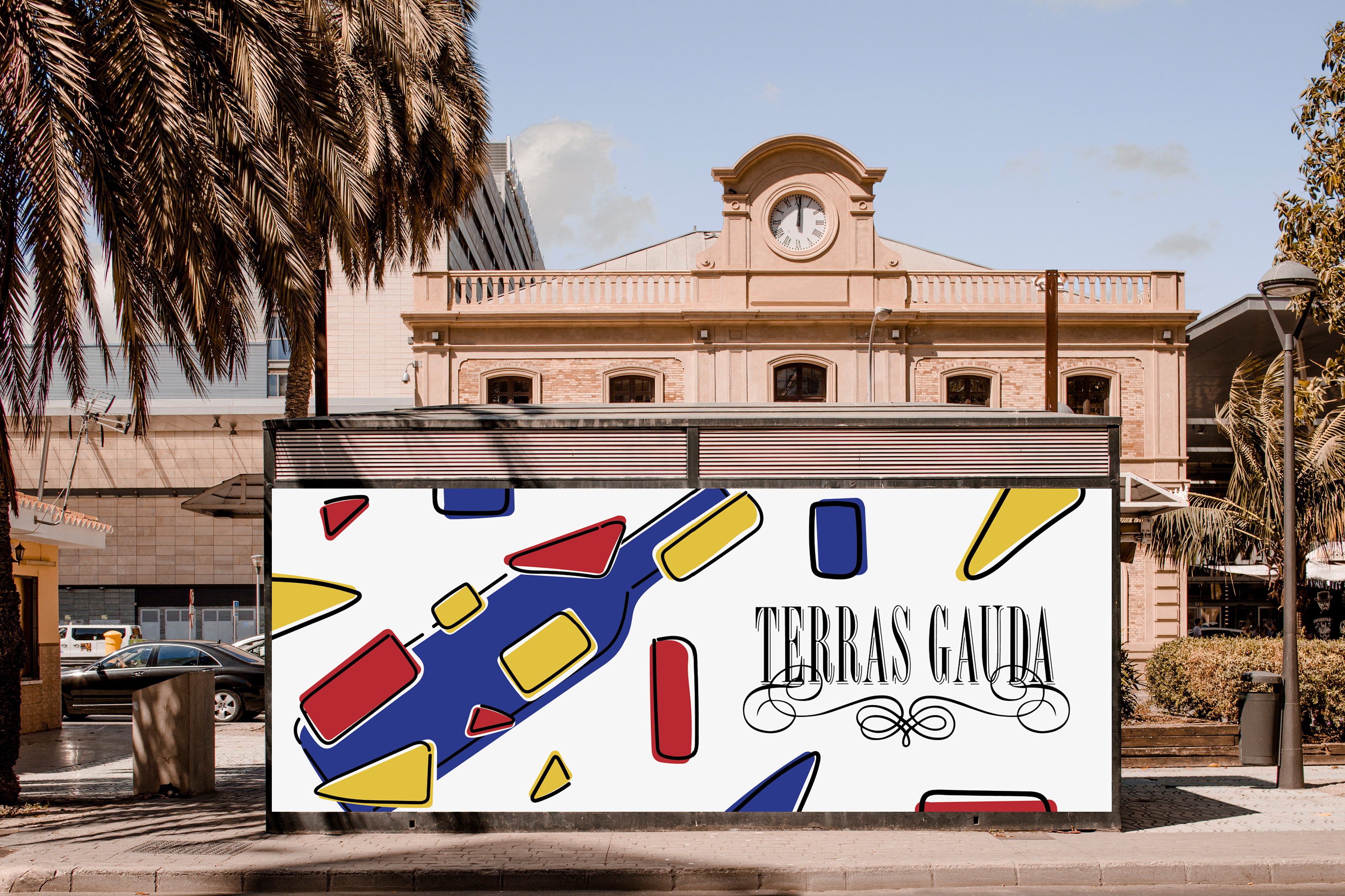
Environmental
Vigo, Spain Port
Web